
How to enhance menu visuals: a restaurant manager's guide
- Abhi Bose
- May 17
- 9 min read

TL;DR:
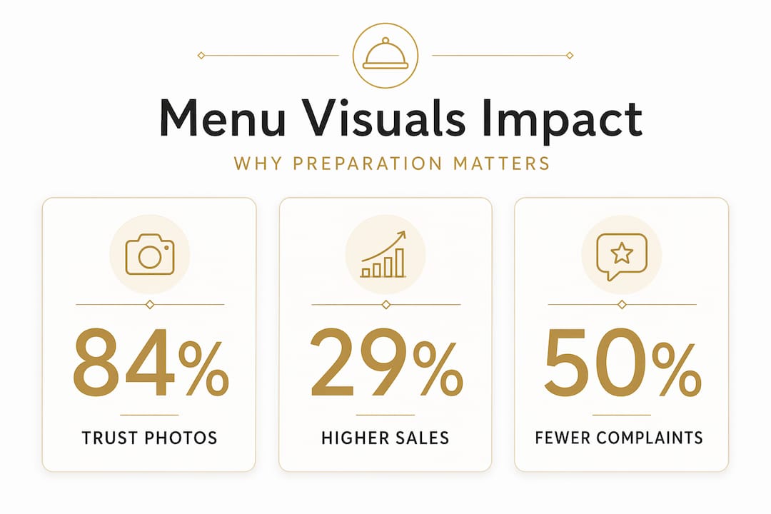
Effective menu visuals influence guest choices immediately and greatly impact revenue. Proper preparation with high-resolution images, AI editing tools, and consistent branding forms the foundation for successful digital menus. Regular data-driven updates and cohesive design choices ensure sustained engagement and trust.
A menu that looks like an afterthought performs like one. Guests decide within seconds whether to feel excited about what they’re ordering, and those seconds are shaped entirely by what they see. Knowing how to enhance menu visuals is not a design exercise; it’s a revenue decision. Poor photography, chaotic layouts, and inconsistent styling quietly drain sales while you focus on everything else. This guide walks you through exactly what to prepare, how to execute a visual upgrade, and how to measure whether it’s working — so your menu becomes one of your most powerful sales tools.
Table of Contents
Key Takeaways
Point | Details |
High-quality visuals matter | Using sharp, well-lit images aligned with your brand increases customer desire and sales. |
Consistency is key | Maintain unified photo styles and colors to build trust and a professional look. |
Use data to guide design | Analytics and guest feedback help optimize menu layout and image choices effectively. |
Avoid visual overload | Limit images to key dishes to prevent decision fatigue and improve satisfaction. |
Leverage AI tools | AI-powered photo editors speed up workflow while enhancing image quality and cohesion. |
Preparing to enhance your menu visuals: tools and requirements
Now that you understand the importance of visuals, let’s explore the tools and preparations needed to enhance your menu effectively. Think of this stage as mise en place for your digital presentation. Rushing into redesign without the right assets is like plating a dish before the oven has preheated.
What you need before you start
Before any design work begins, gather the right inputs. Visual storytelling tips consistently emphasize that the foundation of any great visual menu is high-quality source imagery. Here is what that means in practice:
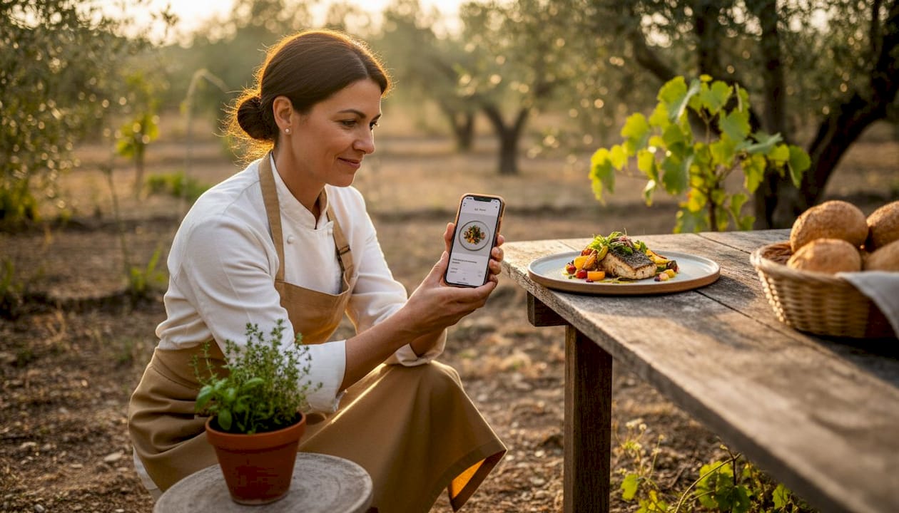
Image resolution: Shoot or source images at a minimum of 1920x1080 pixels for Full HD display screens. Lower-resolution images look blurry on modern tablets and digital boards, which undermines guest trust immediately.
AI photo editing tools: Platforms that use AI to standardize backgrounds, correct lighting, and match color tones across all dish photos save hours and produce results that a smartphone edit cannot replicate.
Brand color palette and typography: Lock these down before you touch a layout. Readable, brand-aligned fonts and a consistent color scheme do more for professionalism than any fancy graphic element.
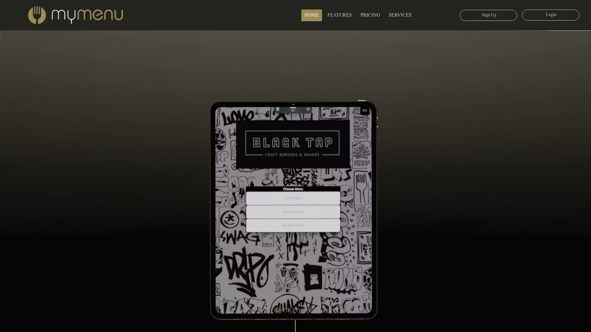
Digital signage software: You need a platform that supports image optimization, layout customization, and ideally video integration. A restaurant menu design guide should inform how you structure the display architecture.
Accessibility standards: The Web Content Accessibility Guidelines (WCAG) set contrast minimums that apply directly to digital menus. Plan for these from day one, not as a fix later.
Why this preparation matters: by the numbers
Preparation Element | Impact |
HD imagery (1920x1080) | Reduces image quality complaints; improves perceived food quality |
Consistent photo style | Creates brand cohesion across all menu sections |
Brand-aligned color scheme | Reinforces identity and supports upselling cues |
Video or animated elements | Sales increase of 3-6% for food businesses using digital video menus |
AI editing tools | Cuts photo post-processing time while maintaining style uniformity |
Knowing how to boost sales with visual content starts with respecting the groundwork. Managers who skip this stage often find themselves redesigning twice.
Executing your menu visuals upgrade: design and content best practices
With the right tools ready, let’s dive into actionable steps to execute your menu visuals upgrade effectively. This is where creative decisions meet business logic, and where the right choices turn browsers into buyers.
Step-by-step execution process
Adopt a mobile-first layout. Most guests accessing a digital menu will do so on a smartphone or tablet. Design for the smallest screen first, then scale up. Navigation should require no more than two taps to reach any item.
Apply a clean, minimalistic structure. White space is not wasted space. It gives the eye a place to rest and directs attention toward the items you want to sell. Resist the urge to fill every pixel.
Use visual anchors to highlight priority items. High-margin and popular dishes deserve prime placement: top-left on a grid, first in a category list, or accompanied by a subtle badge. Strategic menu designs can boost restaurant profits by 15% through improved visuals and layout.
Integrate video and animation where it counts. A short looping video of a sizzling steak or a freshly poured cocktail does something a still image cannot: it activates the imagination. Video integration guarantees a 3-6% sales increase for food businesses, and that number compounds across high-volume services.
Optimize image files for fast loading. Use WebP format where possible. Compress images to under 200KB without visible quality loss. A menu that takes four seconds to load has already lost the moment.
Apply AI tools for photo consistency. Every dish photo should look like it was shot on the same day, by the same photographer, under the same light. AI tools that standardize backgrounds and tone make this achievable even when your photos come from multiple sessions.
Write sensory, descriptive language alongside visuals. Words like “slow-braised,” “citrus-kissed,” or “hand-stretched” activate appetite in a way that purely visual elements sometimes cannot. The combination of great imagery and evocative language is what makes a menu feel truly mouthwatering.
Highlight approach comparison
Method | Best for | Visual impact | Risk |
Badge or icon (“Chef’s pick”) | Flagging specials | Medium | Overuse dilutes meaning |
Photo-only (no badge) | Signature dishes | High | May blend into catalog feel |
Larger card / featured tile | Hero item in a category | Very high | Can overwhelm a small screen |
Video loop | High-margin showstoppers | Exceptional | Requires fast connection |
Pro Tip: Review visual content strategies to identify which items in your current menu have the highest margin-to-visibility gap. Those are the dishes worth investing in first for photography and placement upgrades.
Explore innovative menu design trends for inspiration on layouts that have moved the needle for restaurants similar to yours. And if you need to build or refine your content production process, an AI content marketing platform can help you maintain visual output at scale.
Troubleshooting common menu visual pitfalls
While executing your design, be mindful of these common pitfalls to ensure your menu visuals are professional and effective. Even well-intentioned redesigns stumble on avoidable mistakes.
The most common visual mistakes and how to fix them
Inconsistent photo styles. Mixing studio shots with smartphone snaps creates a menu that looks assembled rather than designed. As noted by the team at FoodShot.ai, inconsistent photo styles make a menu look like it was shot in different restaurants. Use a mode that unifies backgrounds and lighting across all images.
Poor text contrast. A beautiful image behind pale text is unreadable in a bright dining room. If guests are squinting, they’re not ordering. Meet the WCAG contrast standard before you sign off on any design.
Too many images. More is not more. A menu crammed with photos for every single item creates visual noise that actually slows decision-making. Reserve photos for signature dishes and top earners.
Unchecked errors. A misspelled dish name or an outdated price is a trust killer. Proofread every item, every price, and every description before publishing. Build a checklist into your launch process.
Untested screens. A design that looks perfect on your laptop may look washed out on an iPad in direct sunlight or pixelated on an older TV screen. Test on at least three different devices and lighting conditions.
“Consistent, well-lit, and properly cropped photos tell guests that you care about every detail of their experience, long before the food arrives at the table.”
Pro Tip: Review digital menu layout examples to benchmark your design against working models before launch. Seeing what good looks like makes it much easier to spot what’s off in your own work.
Measuring success and optimizing menu visuals
After launching your upgraded menu visuals, it’s important to measure their effectiveness and optimize continuously for sustained success. A beautiful menu that you never revisit is a missed opportunity.
How to track what’s working
Monitor item views and conversions. Digital menu platforms provide analytics showing which items guests click on, how long they spend viewing, and what they order. This data tells you whether your visual hierarchy is actually directing attention where you want it.
Run guest feedback surveys. Numbers tell you what is happening; guests tell you why. Short, post-meal surveys asking about menu clarity and visual appeal give you the qualitative layer that analytics cannot.
A/B test layouts and photos. Try two versions of a category: one with a featured image, one without. Compare order rates over two to four weeks. The results are often surprising and always actionable.
Update visuals seasonally. A summer menu showing winter comfort food imagery feels off. Align your visuals with what guests expect to crave right now, and update promotions to match current specials.
Keep navigation clean. As your menu grows, the temptation is to add more. Resist it. Regularly audit for items that clutter the experience without contributing to sales.
As the MyDigiMenu team emphasizes, reviewing menu analytics regularly allows you to identify items needing better photos or descriptions and to maximize the impact of high-performing dishes.
Use your platform’s built-in data to boost guest engagement with digital menus over time, rather than treating the launch as a finish line. For properties looking to go further, video menus offer a measurable engagement uplift that static images simply cannot match.
Key optimization signals to watch
Click-through rate on featured items vs. standard listings
Average order value before and after visual updates
Guest satisfaction scores related to menu usability
Reorder rates for visually featured dishes
Why a cohesive, data-driven visual strategy wins over gimmicks
Here’s the uncomfortable truth most design conversations skip: a flashy menu update that isn’t grounded in brand consistency and real guest data will fade fast. The restaurants that see lasting revenue gains from menu redesigns are not the ones chasing every new visual trend. They are the ones that build a coherent visual identity and then use data to refine it continuously.
Visual inconsistency is a silent trust breaker. When one section of your menu looks like a fine dining catalog and another looks like a fast-casual flyer, guests feel it even if they cannot name it. That dissonance creates hesitation, and hesitation kills conversion. Every photo, font choice, and color decision should feel like it came from the same creative vision.
AI tools have genuinely changed what’s possible here, but only when used with intention. According to DoorDash’s Head of Product, AI Retouch and AI Replate improve visual presence while preserving the operator’s unique touch. That balance matters. AI should make your food look like your food at its best, not like a stock photo from a generic food catalog.
Data-driven placement decisions are where the real profit lives. Once you know which items guests view but don’t order, you can test whether a better photo or a more prominent position changes behavior. This is not guesswork; it’s iteration. The brands winning on visual content success stories are not the most creative operations in the room. They are the most consistent and the most willing to let data guide the next decision.
Chasing gimmicks, whether that means adding animations to every item or switching to a radically different visual style each season, erodes the brand recognition you’ve worked to build. Guests return to places that feel familiar and trustworthy. Your menu visuals are a core part of that familiarity.
Discover My Menu: your partner for stunning digital menus
If you’re ready to elevate your menu visuals effortlessly, consider how MyDigiMenu’s digital solutions can empower your restaurant or hospitality business. Turning your static menu into a rich, interactive experience doesn’t have to be a months-long project.
MyDigiMenu gives restaurant and hospitality managers the tools to create visually stunning menus compatible with restaurant digital tablet and iPad setups, mobile devices, and wall-mounted displays. The platform’s customizable templates make it easy to apply your brand colors, typography, and imagery without needing a design team. A built-in QR menu generator supports contactless ordering right out of the box, and the platform’s analytics help you measure visual performance over time. Whether you run a single cafe or a multi-property hotel group, My Menu pricing plans are built to scale with your operation.
Frequently asked questions
What image size is ideal for digital menu boards?
The ideal image size for digital menu boards is 1920x1080 pixels for Full HD displays, ensuring sharp visuals and clear text on standard-resolution screens.
How can AI tools improve my menu photos?
AI Retouch and AI Replate tools standardize backgrounds, correct lighting, and match visual styles across dishes, producing a cohesive, professional look that boosts customer appetite appeal without losing your restaurant’s personality.
How many images should I include on my digital menu?
Limit photos to signature and high-margin dishes. Too many images increase decision fatigue and actually reduce purchase intent, so quality and selectivity matter more than volume.
What is the recommended contrast ratio for menu text readability?
Aim for a WCAG AA contrast ratio of at least 4.5:1, with 7:1 preferred for bright dining environments, to ensure guests can read your menu comfortably under any lighting condition.
How often should I update my digital menu visuals?
Update your menu visuals at minimum with each season and whenever you launch a new promotion, using guest feedback and analytics data to guide which photos and layouts need refreshing most.
Recommended